Avalon was built around originality, observation, and a rejection of the idea that identity can be reduced to labels, numbers, or fixed categories. Its faceless, stripped-back visual language was designed to feel universal, a brand that could reflect the people engaging with it rather than prescribe an identity to them. White became a recurring symbol for that idea: visually pure and neutral, yet capable of reflecting the full spectrum around it. In response to an oversaturated creative culture where work is often made for attention first, Avalon focused on returning value to process, intention, and making itself.
That philosophy shaped everything from the brand’s minimal identity to its handmade garments and campaigns, reinforcing the idea that the artwork is not simply the graphic placed on a shirt. The shirt, its construction, process, and story are the art.
The Legacy Project was created to generate local attention around the launch of Avalon’s hand-sewn and printed 001 long sleeve.
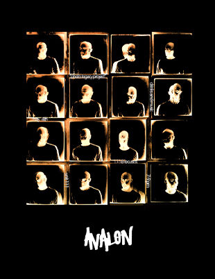
Inspired by Andy Warhol’s Polaroid portrait work, I developed a campaign built around repetition, identity, and uniformity. I designed and distributed posters throughout the area, helping attract more than 50 people to an event where participants were photographed wearing the same garment, in the same pose, against the same background. The imagery reflected one of Avalon’s central ideas: that individuality can exist within sameness, while also commenting on the corporate tendency to reduce people into a repeated image, category, or number. I led the project from concept through execution, including garment production, campaign design, promotion, event planning, creative direction, and final presentation.
Avalon was built around originality, observation, and a rejection of the idea that identity can be reduced to labels, numbers, or fixed categories. Its faceless, stripped-back visual language was designed to feel universal, a brand that could reflect the people engaging with it rather than prescribe an identity to them. White became a recurring symbol for that idea: visually pure and neutral, yet capable of reflecting the full spectrum around it. In response to an oversaturated creative culture where work is often made for attention first, Avalon focused on returning value to process, intention, and making itself.
That philosophy shaped everything from the brand’s minimal identity to its handmade garments and campaigns, reinforcing the idea that the artwork is not simply the graphic placed on a shirt. The shirt, its construction, process, and story are the art.
Avalon’s Poster Campaign was created early in the brand’s development as a strategic way to increase visibility at pop-ups, vending events, and across social media. Because Avalon’s identity was intentionally unconventional and not built around polished, trend-driven imagery, I designed a series of bold posters featuring recognizable artists, cultural figures, and familiar visual concepts to create an immediate point of entry. The goal was to use imagery people already understood or connected with to draw attention first, then lead them toward the garments and the deeper ideas behind the brand. The campaign helped bridge the gap between familiarity and originality, giving new audiences a reason to stop, look, and engage with Avalon.
Avalon was built around originality, observation, and a rejection of the idea that identity can be reduced to labels, numbers, or fixed categories. Its faceless, stripped-back visual language was designed to feel universal, a brand that could reflect the people engaging with it rather than prescribe an identity to them. White became a recurring symbol for that idea: visually pure and neutral, yet capable of reflecting the full spectrum around it. In response to an oversaturated creative culture where work is often made for attention first, Avalon focused on returning value to process, intention, and making itself.
That philosophy shaped everything from the brand’s minimal identity to its handmade garments and campaigns, reinforcing the idea that the artwork is not simply the graphic placed on a shirt. The shirt, its construction, process, and story are the art.
A social and event campaign created to build awareness and excitement around Old Town’s Oktoberfest while capturing the energy of the event itself. I developed promotional content leading up to the event, using social media to communicate key details, establish a consistent visual direction, and build anticipation within the community. During the event, I documented the experience through photography and short-form video, focusing on the people, atmosphere, and moments that defined the day. The resulting content extended the campaign beyond the event itself, creating a cohesive story across social platforms and giving Old Town a library of engaging visual assets for continued promotion.


My campaigns and art direction work uses design, storytelling, photography, and content to build cohesive brand experiences across launches, events, and promotional campaigns.
Co - Founder & Creative Director
cAMPAIGNS & ART DIRECTION
My campaign and art direction work includes Avalon’s artist-inspired poster series, an apparel launch influenced by Andy Warhol’s Polaroid legacy, and Old Town’s Oktoberfest campaign, where I built awareness through social content, event storytelling, and on-site documentation.
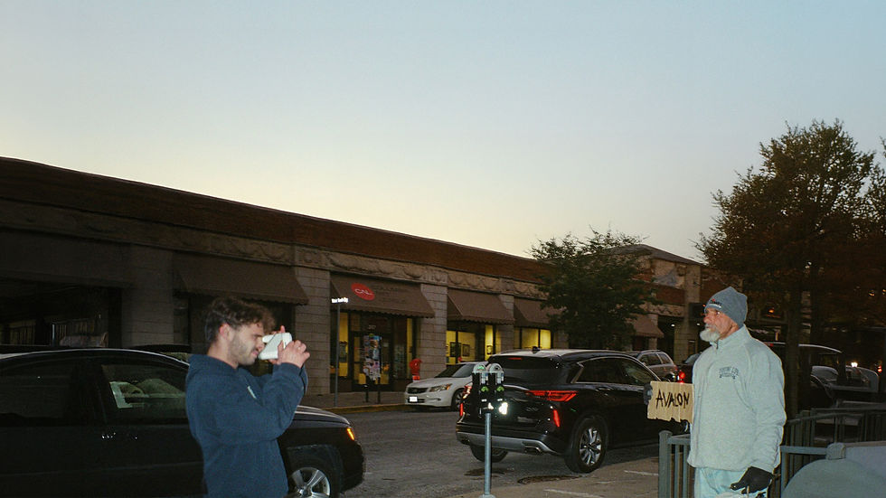


The Legacy Project was created as a campaign for Avalon’s 001 garment, drawing inspiration from Andy Warhol’s Polaroid portrait work. My team and I hosted an event where more than 40 people were photographed wearing the same prototype, using repetition to highlight individuality while also blurring each subject into a shared visual identity. I led the campaign from concept through execution, including garment production, flyer design, event planning, marketing, creative direction, and final presentation.